Synoptic Project Weekly Blog
Links:
This is the weekly development blog for the game project I worked on with Dwight and Dean. It is a 3D platformer game with a variety of different mechanics and platforming challenges, where you play as a blob of scum. We worked hard on this project and I am very happy with the result - you can download it from the link above. The following is my weekly blog posts from start to finish:
Presentation
Playboard
Trello

Week 1/2
This week we decided upon the roles each member would play in the group, as well as creating a concrete idea for the game. I am going to do the 3D modeling, rigging, animation, level design and texturing for the game primarily, while also helping with the engine work and any other general tasks. This initial week was mostly spent on research and smaller tasks.


I started writing the game design document this week. While we had the idea of a scum ball platformer game we didn't know exactly what the game would be. I had some ideas for the game that I wrote in the GDD. The main 3 were:
- A time-trial based 3D platformer with linear levels
- A puzzle based 3D platformer similar to Portal
- An infinite runner style game similar to Subway Surfers
We decided to go with the first option for now, as it seemed the most unique, but this could change in the future.
GDD: https://docs.google.com/document/d/1HoAWoldMFgjqTuFnpEsBz5OOzL4MneOFxkQEoZChLc4/edit?usp=sharing
The general idea is that the player must platform their way through a corridor style level and reach the end under a time limit. The player is a slime ball that can shrink and grow to access different areas. The level is full of hazards and helpers, such as toxic waste or a sticky wall the player can climb on. The player will have to find the most efficient route, combining abilities and the environment to reach the end in the fastest time possible.
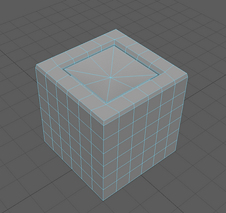
Later in the week I also started working on the modeling. I wanted to make sure I was familiar with the Maya to Unreal pipeline, so I watched a video on it and followed along. I created this simple cube model and exported it as an FBX.
Week 3
This week I started on the player character model and animation. The player is a slime ball that will have an idle jumping up and down animation.
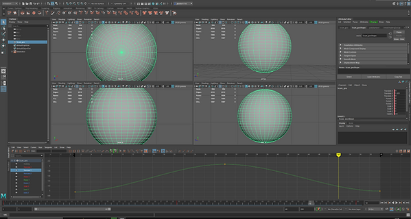
I used the graph editor to make the ball hang in the air more, giving it a smoother and more cartoony look.

I used the graph editor to make the ball hang in the air more, giving it a smoother and more cartoony look. I decided to scrap this asset in order to make a more complex one.
Week 4
This week we discussed some changes and ideas to the project. We decided that as none of us can run Substance Painter we would have a very simple art style. I feel that overall it is a good idea for us to make the game simple and polished, with the chance that we might finish it early and can improve these aspects later.
We also decided on some details about the game during meetings. The game will be similar to Crash Bandicoot, in that the camera follows the character down a corridor style level.
I had an issue with exporting Maya FBX objects to Unreal. This took a while to fix and I asked Leigh to help me with the issue. It turns out that the 4.8 install of Unreal was incompatible with Maya 2020. We decided that we would move to the newest version of Unreal, 4.26, and that I would try and make a start on some Unreal work as Dwight cannot run it on his system.
I spent some time getting up to speed with the basics of Unreal. I created a basic level and followed this tutorial: https://www.youtube.com/watch?v=RTvTIbCpODU
I found the tutorial helpful for getting started. I was able to make a player controller and have the camera follow the ball but not rotate.

Week 5
At the beginning of this week I spent more time in Unreal. I did not add much, but I wanted to get comfortable with the Maya > Unreal pipeline. I had a discussion with Luca about some points in Unreal. I decided to have a look at texturing in Unreal as an alternative to Substance. I think it will work for our simple art style. I also had a look at collision on assets in Unreal after having an issue with the player spawner and an imported asset. By default, assets will have a simple box collider around them. I found out that you have to use the editor to add complex collision to assets that need it, then remove the simple collider.
For the rest of the time I spent on the project this week I made assets in Maya. I wrote down an asset list and made assets such as the trampoline, sewer pipe and a new player model.


I decided to rig the player model. I had never done this before and it was quite a useful experience as an introduction to rigging. I followed this tutorial: (https://www.youtube.com/watch?v=1wvdQy2Fdhw). The player is a blob so a rig wasn't really necassary as animating it wouldn't be too complex. I hoped that it might make it easier to import into Unreal as well as potentially allowing me to copy the animations from the rig to another model (for customisation).

I also added some UVs

I had an issue with the rig where I couldn't control much towards the front of the model, as only the second and third controllers actually affected the model (the first one just moved the whole model). I decided to start from scratch to avoid issues with deleting joints, and did the same thing again but with a 4th 'root' joint. Now I have more control over the front end of the model, which might be helpful for future animations like death, jumping and shrinking/growing.

Week 6
This week I started making animations using the rig. I made a basic forward movement and jump animation. I then followed some tutorials on how to export animations from Maya to Unreal.
First, I selected all the joints and constraints using select > heirarchy and baked the animation in edit > keys > bake simulation. I then selected the mesh and joints and used the game exporter to export it all as an FBX. I had to be sure to tick the animation box in the exporter settings, as well as creating an animation clip in the animation tab. I then imported the asset into Unreal.
Doing this successfully imported the animation into Unreal. However, the model looked very low poly in the engine. I could not figure out why this was.

Week 7
So far we have not put much of our work together yet. I wanted to spend some time in Unreal in order to get a test level set up where I can import mechanics. While I was in Unreal I decided to spend some time figuring out collision. I had an arch asset from Maya that I wanted to use as walls for the levels, but I could not find out how to create collision so that the player can enter the inside of the arch. I found out from the Unreal website that I can use Auto Convex Collision, which makes a custom collision box around the mesh with a set number of vertexes. The other more simple method is to use box colliders and scale/duplicate them to fit around the mesh. I went with the latter as the convex collision seemed too complicated for a basic shape.
Besides this there wasn't much else I could do in Unreal. Once Dwight makes mechanics such as the player controller, trampoline, player death etc I can add them to the levels and start bringing them together.
I went back to working on the animation. After having a discussion with Luca I agreed that I should add deformers to my character rig. This would allow my character to change scale during animation, so I can apply squash and stretch. I followed a tutorial and used Deform > Lattice to create a box around the model that can be used to scale it. I selected 4 vertexes each on the top and bottom and used Deform > Cluster to create a point where I can scale the model up and down. I created controllers for each cluster and that was it. I found an issue afterwards where the mesh would revert to default when leaving the bounds of the lattice (which would be a pain for jumping animations). This was a simple fix, fortunately - there was a tick box in the lattice options that made the mesh keep it's transformations outside the lattice.


Week 8
At the start of this week I had an issue with my rig. In order to try and fix the topology issues when importing the mesh I used mesh > smooth to make the model higher poly. This was fine, but I then decided to delete the eyes and replace them with high poly cylinders. After doing that and combining them with the mesh, I realised that the eyes did not move with the rest of the mesh. I spent a while trying to fix this, I tried parenting and point constraining but nothing worked. I had also overwritten the save - not expecting anything to go wrong. I had to redo the rig, which didn't take too long.
When this was done I re-did the walking and jumping animations. Using the new deform lattice I was able to add squash and stretch to the animations. The jump was difficult - it was hard to figure out when to put each keyframe and how to move the character in the air to make it convincing. I am happy with it for now but I may return to it later; it has squash and stretch and looks like a jump, but it looks a little bit stiff. I also made a death animation where the scumball deflates into a puddle.
Moving on from animation I decided to start adding the hats to the model. I modeled a top hat and combined them, but similar to my issue with the eyes it did not follow the model when I moved the controllers. I found a simple solution using Deform > Wrap, which makes the hat follow perfectly (this may have been useful earlier).
I started with a top hat, which was very easy. I then moved on to making elvis hair. I decided to make a low poly version of the hair and then use the Mesh > Smooth tool to make it more organic looking. I made the shape by extruding a cube and using Edit Mesh > Merge on some vertexes. I think this worked really well and it will look good with some textures. I did a similar thing for the rubber duck hat. This one was more challenging as the shape had to look right. I think the final product looks good, he could be a bit more rounded but it is obvious that it's a rubber duck.


Week 9

I started this week by making some sunglasses. I have found so far that low poly modeling is a very effective way of making models like this faster and easier.
I spent a lot of time trying to import the models and animations to Unreal. I could not get it to work, as I kept getting an error. I tried many different combinations of tick boxes, different fbx versions and different selections - but I couldn't figure out the issue. I hope it is an obvious solution that I will come back to later.
Later on in the week I started making the rat enemy. I decided to use an image plane for this as it was difficult to get the proportions right without reference. As always I started out with a low poly blockout of the shape.


When I was done I used Mesh > Smooth and made some edits to make him look less realistic. I didn't want the rat to look too uncanny or out of place. I gave him big spherical eyes and a nose - using Deform > Wrap to attach them to the model.


When I was done I used Mesh > Smooth and made some edits to make him look less realistic. I didn't want the rat to look too uncanny or out of place. I gave him big spherical eyes and a nose - using Deform > Wrap to attach them to the model.
Afterwards I added controllers to the joints and made a walk cycle. This was harder to animate than the scumball's animation as there were more joints involved. I also made a death animation for the rat.
When I was done with the rat I made some geometry for the levels. The game takes place in a long, straight sewer tunnel - so the plan was to make different segments that I could piece together in the engine to make the walls of the levels.
I also spent some more time exporting assets into Unreal. I found out that triangulating the mesh in the export settings allowed me to import successfully into Unreal.
I decided to also have a look at materials in Unreal this week, as I planned to paint/texture level assets in Unreal. I started by first making a basic material using a base colour and an emissive value. I then tried making a better material combining a normal map with a texture. This would work for our level assets.


Week 10

Week 11
This week I started making my playboard of the game. This showcased the mechanics and design of the game visually. I used the artboard function in Photoshop to make multiple slides that showcased gameplay elements.


I was finally able to get an asset, rig and animation together into Unreal. I have spent a lot of time on trying to fix issues and get the animated models into Unreal smoothly. I was able to get the animation to play in the game. The protagonist still would not import, however. I realized that the issue was the deform lattice I was using. The import would not recognise the model as a mesh and when I deleted it it imported fine.

This meant I had to find another method of scaling with a rig. I found the squash deformer in Deform > Non-Linear > Squash. This looked to be a better fit than the lattice as it had more options for scaling the mesh and is a child of the mesh, rather than squashing the mesh externally. I was successfully able to export this into Unreal using the squash deformer.
I also realized that I could not use Deform > Wrap to attach models to eachother. When importing to Unreal each mesh has to be one single model. I will revist how to approach the character creator when I get around to scripting it.
Week 12
I began this week by re-doing the animations for the protagonist character using the new deformer. This didn't take too long as I could base the animations off the old ones. These are the new animations, as well as the rat animations I have already completed:
Walk
Death
Jump
Rat Walk
Rat Death
I am happy with how all these animations have turned out. I like how the protagonist is based around squashing and stretching, while the rat is a more traditional rig with legs. The playblasts are at a lower speed than the real animations, so they look stiffer here than they will in the finished game. I could make more animations, such as one for the rat turning around (and might in the future), but I think this is enough for the scope of the project.
I made a quick bin model to use as a collectible. The idea is to have it float in the air with particle effects, and serve as a collectible that gives the player secrets to look for and reward exploration.
I then spent some time copying over the different hats into their own scenes. I feel that the best idea for hat swapping is to attach a separate hat actor to the player in Unreal. I am not sure about how this system will work, but for now I think it will be a good idea to separate the hats and delete their history.


I made a simple script that changes the player's colour (to use in the character creator). This simply sets the material of the player mesh when the player presses a button. This should work, the only obstacle being how to tie the script to pressing a UI button. We may also want to allow the player to pick a specific colour value, rather than cycling between materials.
I noticed something useful about the player mesh. The eyes and body appear in different material 'elements'. This means I can have seperate materials for both of these. This is a relief as the original plan was to make custom textures in Photoshop, and make a section for the eye UVs.
Week 13


I started this week by touching up some of my models and making the final version for the game. Now that I knew how Unreal worked with materials, I was more confident making character models for it. I created pupils for the player model, as well as making an alternate slug player model. I used Mesh > Combine so that each part could have a material added in Unreal. I also made the models higher poly so that they look better in the engine.
We also had a discussion about the character creator. Unreal has a 'socket' system where you can attach one model to another, so a character can carry something, for example. The plan is to use this to add hats to the model. Rather than swapping out the entire model we can simply swap the hat attached to the socket in blueprint.

I decided to make some idle animations for the character creator, as well as when the player is still. I wanted the slug character to have different animations, so I rigged the eye stalks so I can move them around. I had an issue where parts of the mesh would follow the rig. I found a solution to this in skin weights. Using the Skin > Paint Skin Weights tool I can make parts of the mesh weighted down, so that they require more joint movement to move them. This seems useful if you wanted to have a stretchy object and a more rigid one on the same rig.
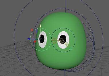
For the main player model I wanted to have the pupils move in the idle animation. This animation will play continuously in the character creator so I made the character more expressive with eye movements. My original idea was to use Constrain > Aim, which is what most eye rigs use. However, this didn't really work as the pupils are flat and rotated into the eye when I moved the controller. I decided to use a point constraint instead. Luckily, this still works when I combine all the objects together and it should export fine. I made a long idle animations where he bobs up and down slightly and looks around.
When I was finished with the animations I had a lot of trouble exporting it. I realized that I can't import the mesh in Unreal without deleting history. This means that I cannot merge the objects together and keep the eye animation. I either needed to find a way to control the eyes with a joint rig, or bake the animation into the mesh.
I also made a final version of the rat enemy. Luca suggested that I move the root of the rig to the hips, rather than on the nose. This is common practice with rigging - human rigs will have a root in the hips, with two joints at either side for controlling the hips. I added a few more joints. Each leg now has three joints and the tail has more joints. I then remade the walk animation with more head and shoulder movement, as well as a smoother tail.

I spent a long time trying to import the protagonist idle animation. I tried many solutions, such as making a more complicated rig to replace the squash deformer and baking the animation into the mesh and exporting it. None of this worked so I decided to delete the squash deformer. Leigh suggested that I import the joint animations - as they work fine - and add squash and stretch in Unreal.

I made a new rig for the protagonist - very similar to the old one but with more joints. I then remade the walk and jump animations without squash and stretch. When they were done I exported both animations and the rigged mesh into Unreal, which went smoothly.

I had a slight issue where the imported models looked like they were made of squares. This was a simple fix, all I had to do was untick the 'Split Vertex Normals' option in the game exporter. I sent the models and animations to Dwight to start attaching them to the player. From now, I had to make the level geometry, research how to squash and stretch in Unreal and make the materials.
Week 14
This week I began exporting the hats to Unreal and making materials for them. The plan for this project was to use Unreal materials for everything, rather than applications such as Substance Painter or Photoshop textures - as we did not have access to Substance and Photoshop is time consuming. I was able to apply materials to different sections in Maya, which would then allow me to swap them out for Unreal textures in the engine.


I found this to be an efficient workflow and I was able to make and import hats quickly. For most of the materials, I chose a base colour, then adjusted it by either adding a normal map or adjusting elements like the specularity and roughness. I could have used the default Unreal materials, but I wanted to stick to the simple block colour art style. I am most happy with the look of the sunglasses and the rubber duck. I was able to make a specular effect on the sunglasses lenses that makes them look convincing.

I also made this material for the toxic goo. I used a panner node, which makes the texture move. I also added an emissive colour value to give it a glow.


These are some demos of customizable characters. This was just to get an idea of what options we would have and what kind of combinations you can make. I wanted the player to be able to combine different hats and colours together to make characters - rather than just picking a random colour and hat.
At the end of the week I got started on the level design. I blocked out the level layouts and imported all the level geometry and assets I had made so far. I made various pipe assets to place around the scene.


Week 15
This week I got some feedback from Luca about my animations. It is unnecessary for my animations to have so many frames (300) and they did not need to be 60fps. I reduced the animations to 24fps. The animations looked good in the engine, however the jump animation had too long of a windup. I reduced the time of the windup to 4 frames. This made the jump animation function well when attached to the player controller.

For the rest of the week I worked on the level design. I decided to work on the lighting later as it was quite time consuming and I wanted to focus on the layout. I wanted to introduce the mechanics intuitively as the level went on - with simple demonstration areas leading into more complex designs that use multiple mechanics together. I was initially going to plan the levels out using photoshop, but I found that blocking out in the engine was easier.
As the levels came together I was quite happy with the layouts. The only issue is that the materials scale with the objects. I need to find a way to stop the materials from scaling.


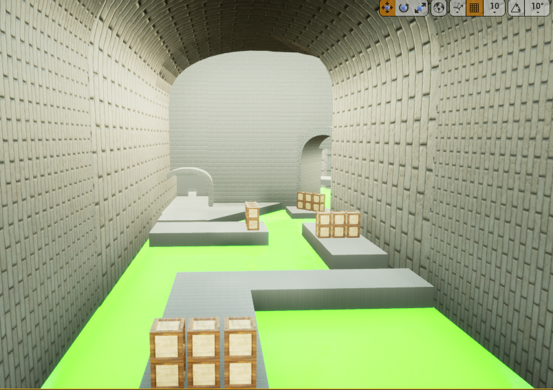

I followed a moving platform tutorial in order to make objects that bob in the water.

I also made some more assets to use as platforms. I wanted to increase the variety of platforms, rather than just having them all be cubes with a brick texture.

Week 16
To start off this week I went back and finalized the animations for the slug player model. I made sure to make them 24fps. They are mostly just remakes of the default animations, but I tried to add some extra character with the eye stalks moving and flopping around.
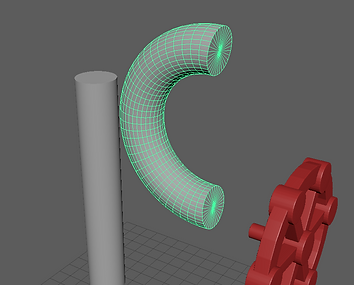
After this I started working on more assets. I found the Deform > Non-Linear > Bend deformer, which allowed me to make easy, smooth curves for pipes.
I wanted to create a decent collection of assets - to make the level look alive and interesting. These are some of the assets I came up with:
 |  |  |  |
|---|---|---|---|
 |
I went back to working on decorating the level and lighting. I added pipes and walkways around and placed point lights around. I still need to sort out the materials but I am happy with the overall look of the game. I also added the bobbing script onto a few objects and placed them around in the water.

Week 17
I got some more feedback from Luca, who suggested that I add more puzzles and secrets. We had the idea to use physics to create a puzzle. I agree that the game needs more problem solving - I will keep it in mind as I extend the level. I also wanted to add some secrets into the existing parts of the level that require exploration or logic to find. Luca also suggested that I vary the materials in the level a bit, and fix the issue where they do not scale properly.
We started adding decals throughout the level. Dean drew them in Photoshop and I imported them into Unreal. We initially had an issue where the decal would appear as a square - but that was fixed by changing the file format to .TGA. We added toxic warning signs to the barrels and graffiti on the walls. I was very happy with this, as it meant we could add more character to the environment without having to texture it.


After this I made some more pipes in Maya. I figured that we would need a variety of different pipes, so I saved a project with different segments that I can connect together to create different shapes. I used the bend deformer to create smooth corners. This tool is very useful, but requires deleting history after using it, as it adds a deformer to the object that might cause issues when importing or transforming the mesh.

To go with the pipes I made a small gauge to add a bit of variety to the pipes. I spent time looking at other 3D sewer environments as inspiration for assets. While I was making this I discovered the circularize tool, which allows you to turn any faces into a circle without creating any Ngons.


To go with the pipes I made a small gauge to add a bit of variety to the pipes. I spent time looking at other 3D sewer environments as inspiration for assets. While I was making this I discovered the circularize tool, which allows you to turn any faces into a circle without creating any Ngons.

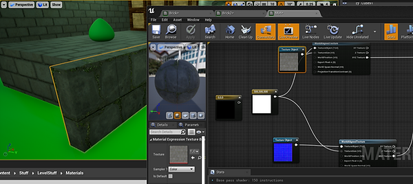
After adding a few of the new pipes to the scene I spent some time trying to fix the scaling issue on the materials. I found a solution using the WorldAlingedTexture node, which makes the texture have a consistent scale no matter what. This was exactly what I was looking for, and I made a few materials using this method. Using these materials I added some more details into the level geometry, such as a lip around the edge of platforms in a different material. I also experimented with combining different textures and normal maps, when I managed to make some unique materials such as mossy tiles.
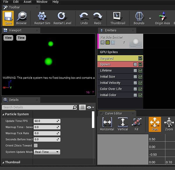
When I was done with this I moved on to introducing myself to Unreal's particle system. I wanted to add particles around the level to make it look more dynamic, as well as draw more attention to the collectible bins. I followed a tutorial and familiarized myself with all the different options. Unreal particles are based off materials, so I had to create one first as the tutorial showed. I then experimented with the options and managed to make a bubble effect, where the bubbles drift upwards in random directions and disappear. I placed the emitter in the water and it looked great. It makes the water look more convincingly like toxic goo.
While trying out the different options I found one that allows you to use meshes instead of particles. I had an idea to make different pieces of junk that will float along the water in part of the level. I made the particles move along the Z axis so it looks like they are being carried by the water. I added the tuna can and made another tin can. I then had the idea to put rats in tin cans - as if they are travelling through the water. This turned out great, it adds some more comedy to the game while also making the level feel more dynamic.

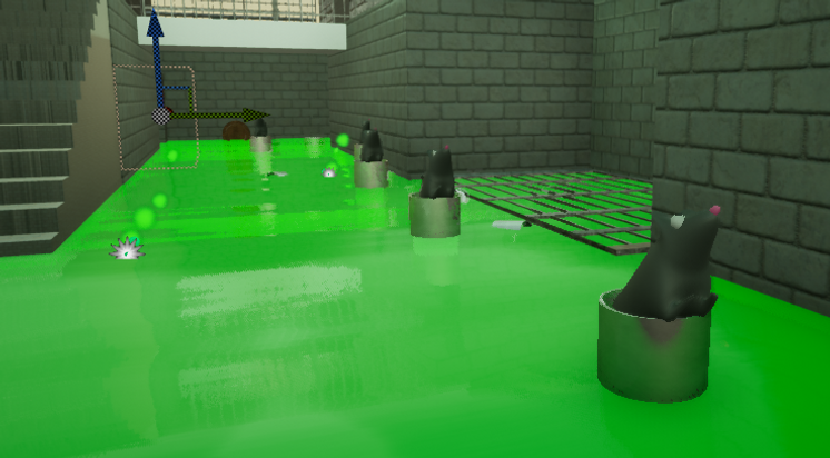
After this I extended the level a bit more. In the previous sections I added a secret route where the player can get a collectible by climbing up a crate. I wanted the game to have a lot of secrets like this, to encourage the player to pay attention to the environment and explore. Then I added more onto the end of the level. I tried to keep the levels complex, using multiple different mechanics together. This part features a lot more rat enemies, as I wanted to show them off and make the game more difficult as it went along.


At this point, the development was going really well. We only had 2 weeks left, but the game was coming together rapidly. I had the idea to add a final boss to the game. The end of the level will feature a giant king rat that shoots lasers. The player must platform towards the boss, dodging lasers and rats, and eventually jump on the boss and defeat it, ending the game. This wasn't the original plan, but I thought the development was going well enough that we could be a bit ambitious. Dwight is working on programming it, while I will make the boss arena when I am finished on the rest of the level. I loved the idea that the game almost has a story, where the sewer is run by the rats and is trying to avoid them and eventually defeat them. This wouldn't be told to the player, but the environment will tell the story - graffiti made by rats, rats watching from the pipes and walkways and patrolling the level.
Lastly, I made an idle animation for the rat that will be used by the static rats placed in the environment, as well as the enemies when they are not moving.
Week 18
- EP curve wire
- Physics
- Crate break works
- Bringing project together
- Big level part
- Unreal fixing
- Spinning moving platforms
- Animation
- Rat King
- Barrels
At the start of this week I made a wire using the EP curve tool. I had used this tool before for my imagined worlds project. This wasn't very important but the tool is very useful for making rope and wire with lots of organic curves.
Back in the engine I added physics to objects around the level. The player (and rat enemies) can push around these objects to make the level a bit more dynamic.
This week I spent a lot of time fixing issues. Me and Dwight combined our projects and I spent a lot of time tweaking the crates so that they worked in the context of the level. Originally the crate debris had collision and caused the player to get stuck. We tried many solutions and eventually decided to have the debris have no collision and instead use invisible walls that blocked the player unless they were large size. Besides this there was a lot of tweaking and integration needed with a lot of the mechanics such as making floating crates breakable, adding rat enemies and sorting out collsion issues with the player controller. During this time I was also making decorative assets such as a fusebox, wires and pipes, as well as adding some of Dean's decals into the level.
After fixing most of the glaring issues I continued extending the level. I wanted to keep the level interesting by adding new mechanics and expanding on existing ones. I made a large dome area that I planned to make an elabourate section with different paths and mechanics. Leading up to this I added a physics based obstacle where flaming barrels continuously spawn and the player must weave through them. I was initially going to use a simple moving platform script I made earlier but I found physics to be more interesting and fun for the player. I made a barrel actor with physics and a flame effect, as well as a blueprint that spawned them and destroyed them after a certain amount of time.
Moving on from this I made the dome section of the level. I spent a long time designing different paths the player can take using different mechanics. This was the first part of the level that featured moving platforms - an elevator platform and a rotating turbine. While I liked how the game slowly introduced new mechanics and obstacles I think on reflection it would have been a better idea to make these mechanics from the start so I could use them earlier in the level if I wished. It was too difficult to go back and redesign old sections to fit new mechanics, although it was difficult to know what worked and what didn't without creating the level first. I made two different paths the player can choose, utilising the size changing mechanic, moving platforms and platforming challenges. The player can explore both routes in one playthrough if they wish to collect all the bins. I was very happy with how this part turned out and I put a lot of work into it.
While working on this project I found that I had a lot of work to do designing the levels, modeling, fixing and making new blueprints and adding elements such as idle animations. I adopted a workflow to make this easier: I first modelled and UVed the new assets for the section, then blocked out the layout using the assets, then added mechanical elements such as the moving platforms and breakable crates. I decided to leave the lighting and environment decorating until later, as I wanted to get the level layouts finished. Development was going smoother than expected so I wanted to make the game as intricate and fun as possible. I was enjoying working with Unreal and Maya - designing levels and environments using my own assets was very rewarding.
To close out the week I started working on the boss fight. I made a long corridor section with flaming torches and cages with rats and different player models inside. I wanted to make this part starkly more dramatic than the rest of the game for comedic effect. After this my goals were to finish the boss fight and start decorating and lighting the level.


Final Week
- Boss Room
- Lighting Build
- Decoration, decal
- Final
In the final week the goal was to finish everything and polish the game to be released. I added some decorative assets around where there were empty spaces, as well as adding decals around the level. I was happy with the look of the level overall - I think all the 3D assets, particles and decals work well together to make the environment look interesting.


When I was satisfied with the look of the rest of the level I made the boss room. The idea was for the player to platform towards the boss in a large chamber, grow to large size and kill the boss - displaying the level complete screen. I kept the orange lighting from the lift room and made a new lava goo material to make it look as dramatic as possible. The rat shoots lasers at the player as they get closer, and I added obstacles like trampolines and another flaming barrel segment. This was actually a challenging part to make, as I wanted to keep the sight line from the elevator to the rat king clear so the player can see as they come up. This meant avoiding any platforms in the middle. I decided to have the bulk of the platforming on the right wall, using a bridge along the ceiling to cross over. I think this area turned out well - I think it adds a lot to the game by looking so different to the rest of it. It would have been nice to spend more time on it. It could have used some unique assets and some more detail in the environment, but the deadline was coming up and we had a lot of troubleshooting to do.

When I was satisfied with the look of the rest of the level I made the boss room. The idea was for the player to platform towards the boss in a large chamber, grow to large size and kill the boss - displaying the level complete screen. I kept the orange lighting from the lift room and made a new lava goo material to make it look as dramatic as possible. The rat shoots lasers at the player as they get closer, and I added obstacles like trampolines and another flaming barrel segment. This was actually a challenging part to make, as I wanted to keep the sight line from the elevator to the rat king clear so the player can see as they come up. This meant avoiding any platforms in the middle. I decided to have the bulk of the platforming on the right wall, using a bridge along the ceiling to cross over. I think this area turned out well - I think it adds a lot to the game by looking so different to the rest of it. It would have been nice to spend more time on it. It could have used some unique assets and some more detail in the environment, but the deadline was coming up and we had a lot of troubleshooting to do.
It is worth mentioning that we had some issues in the final steps of the project. Firstly, the lighting wouldn't build due to a strange error 'swarm failed to kick off'. This was quite a long issue to fix. First, I had to make a copy of the project and start deleting assets to find any that were causing issues. Stupidly, there was just one asset in the level causing issues - a wooden plank bridge that only appeared once. After deleting that and replacing it this issue was fixed.
Once this was fixed, we made some final adjustments and shipped the project.
Conclusion and Reflections
This project was a brilliant learning experience for my 3D and game development skills. Having to make a complete game from scratch, combining different tools and having a long list of tasks was a very useful experience. I had to learn how to rig and animate characters from scratch, work and program in Unreal Engine, create and export assets from Maya and to plan and work on a large project with a group. I feel much more confident with game development/3D now ; having to troubleshoot issues and learn skills on my own was very helpful.
I feel that the project was a success, and that we exceeded what we originally thought the game could be. When we started the project during lockdown progress was quite slow. It was quite daunting to start - we didn't know what was too ambitious or what would be easy to make. I struggled with rigging at the beginning, especially exporting a rig and animation successfully into Unreal. I understand the pipeline much more now. If we had to make a similar project again, I am confident that we could complete work much faster and create a more ambitious project. Our group worked well together once we got more accustomed to the work and lockdown ended. We did have meetings during lockdown where we planned and discussed what we were going to do. Once this was over we found it much easier to simply work and communicate as we did.
If I had more time, or could do the project all over again, I would be more ambitious with the game design and complexity. The shrinking mechanic was a highlight of the game for me, I liked how the levels had to be designed around the player's size and access to growth powerups. I would have more mechanics that build on the idea that the player is a scum blob. We did initially have a plan to have a sticky wall the player walked along, but we scrapped this due to it being to difficult to program. I think this would have made the game more unique and more in line with the concept.
I enjoyed creating the level for the game. I think it is something I would like to look into as a career choice - a level designer/ environment artist. Once I got used to it the pipeline for creating assets and then being able to place them around a scene was very satisfying. I also liked designing the layout for the levels, creating unique platforming segments that utilized the different game mechanics.

