Induction Game Project
As our year 2 induction project we were tasked with creating a game in Unity. We collectively decided to create a 2D platformer where the player platforms through levels and shoots enemies. In my group my role was character design and animation, as well as elements like UI and consumables. I also helped with some of the level design and programming. I used a tool called Piskel to produce my art, as it was a simple and intuitive tool for creating pixel art, and would allow me to produce work faster than in Photoshop. It also has options for creating gifs and sprite sheets, which allowed me to quickly import my sprites into Unity.
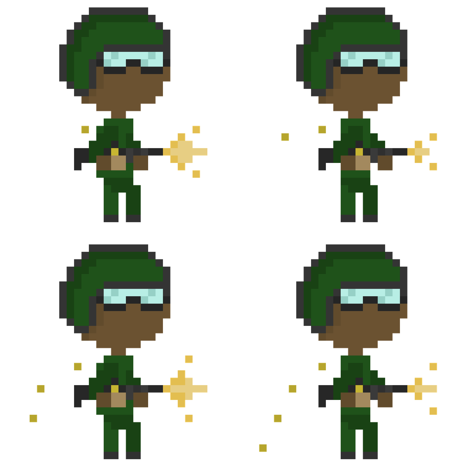
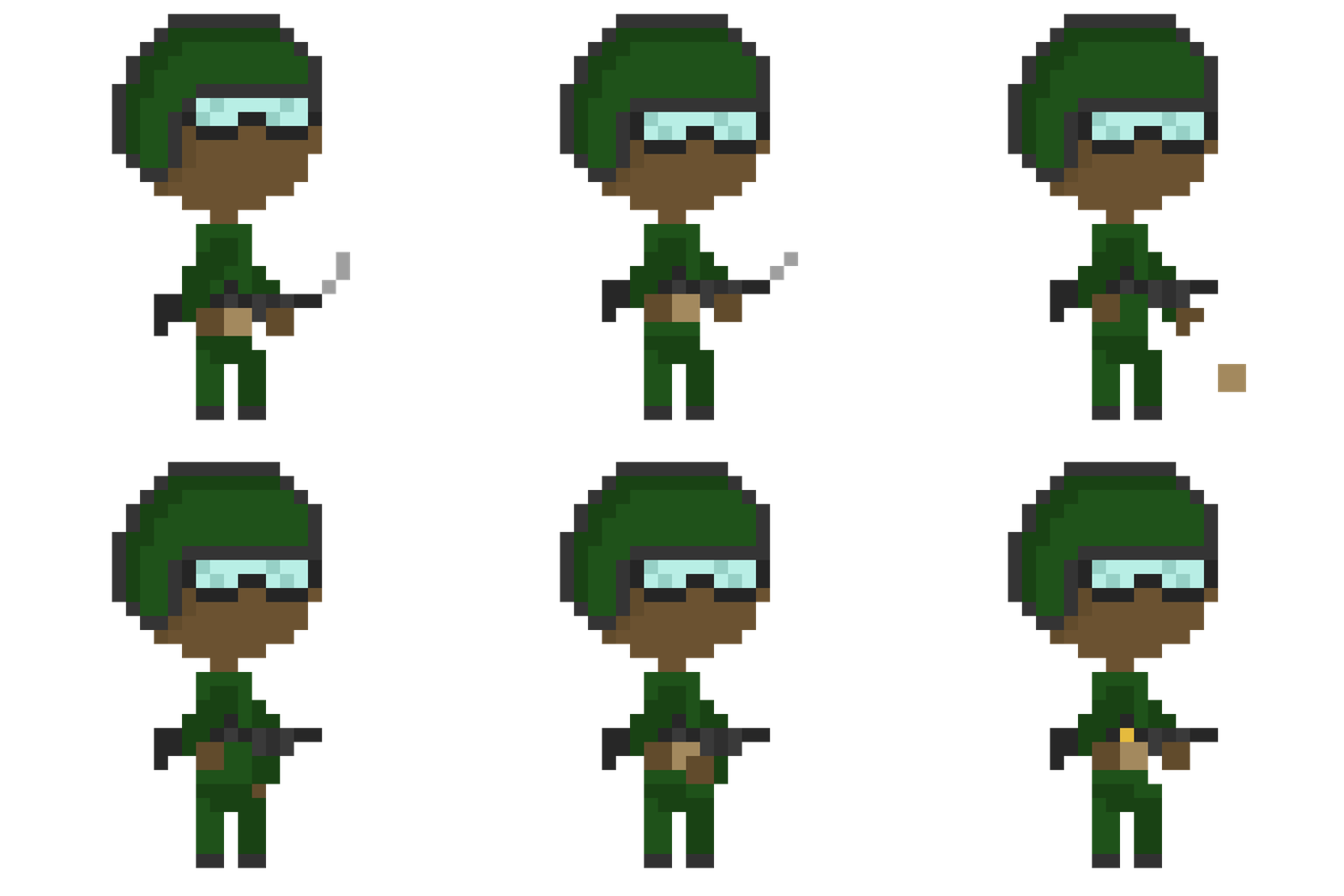
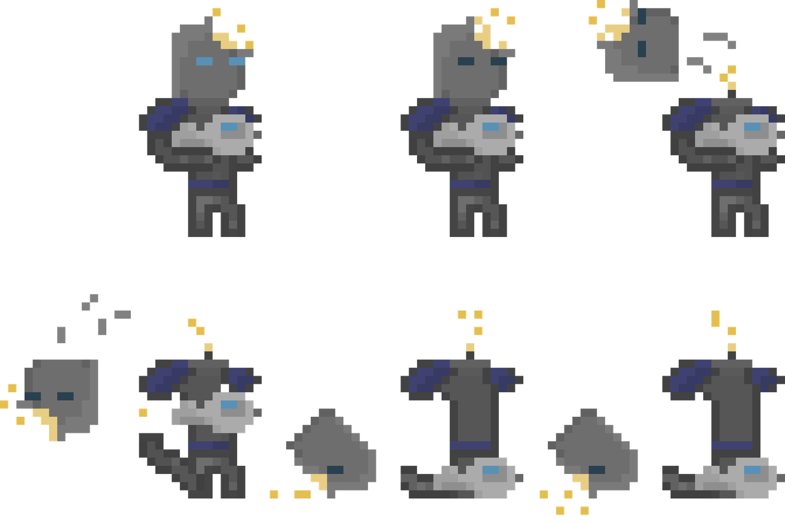
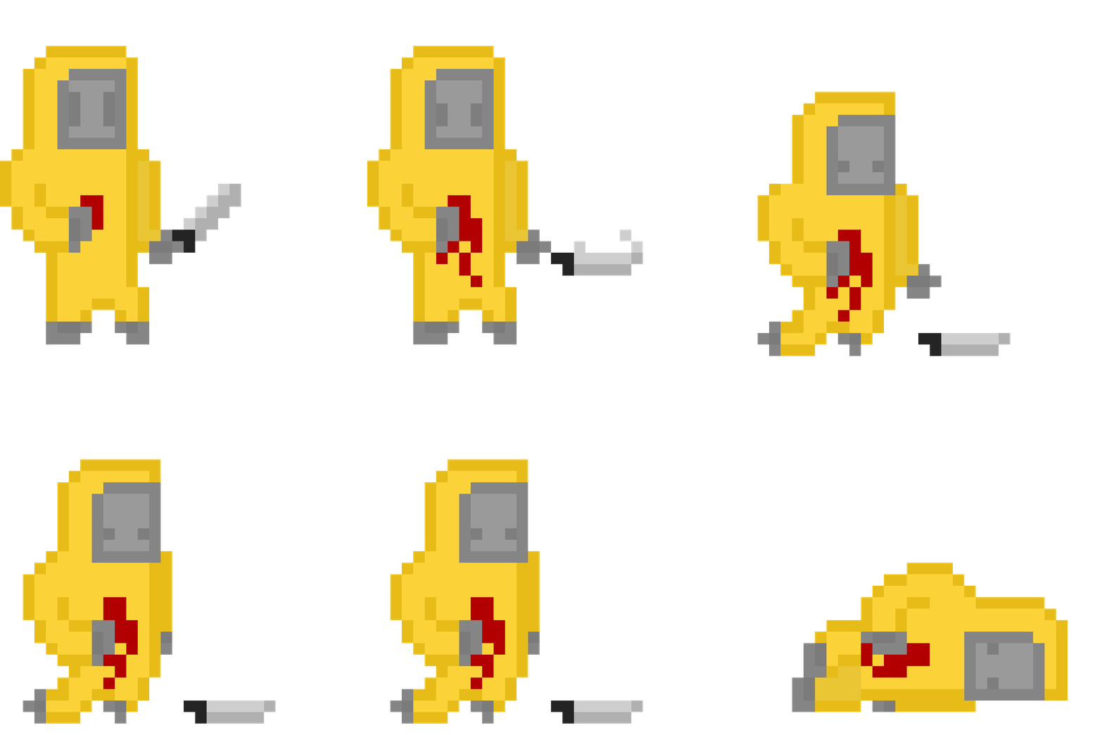
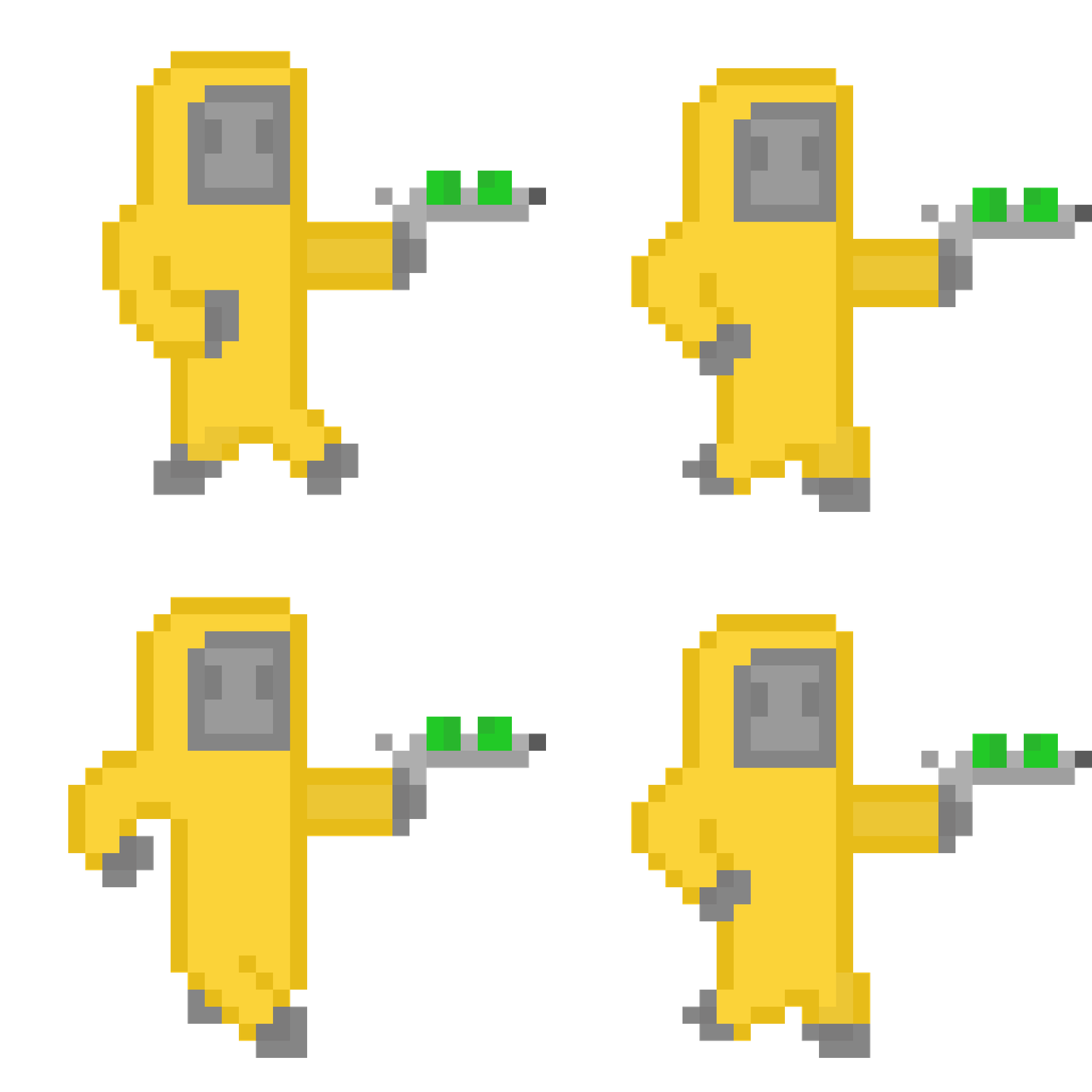
We decided to use a simple pixel art style, as this allowed us to create many different animations and characters within the time constraints. Had we gone with a more complex style we would have sacrificed the quantity of characters, making the finished game more bland. It also conveys the lighthearted tone of the game well. Here are some examples of sprite sheets and animations:



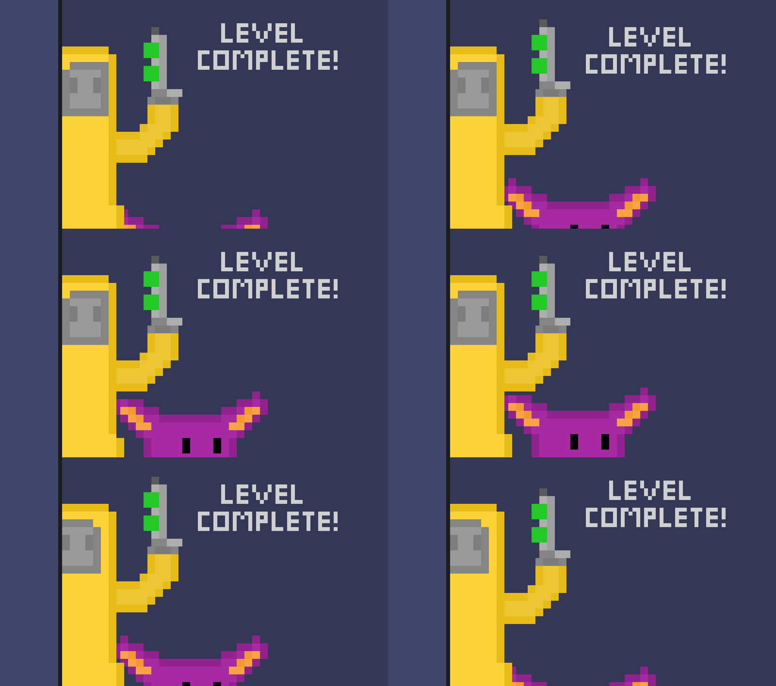
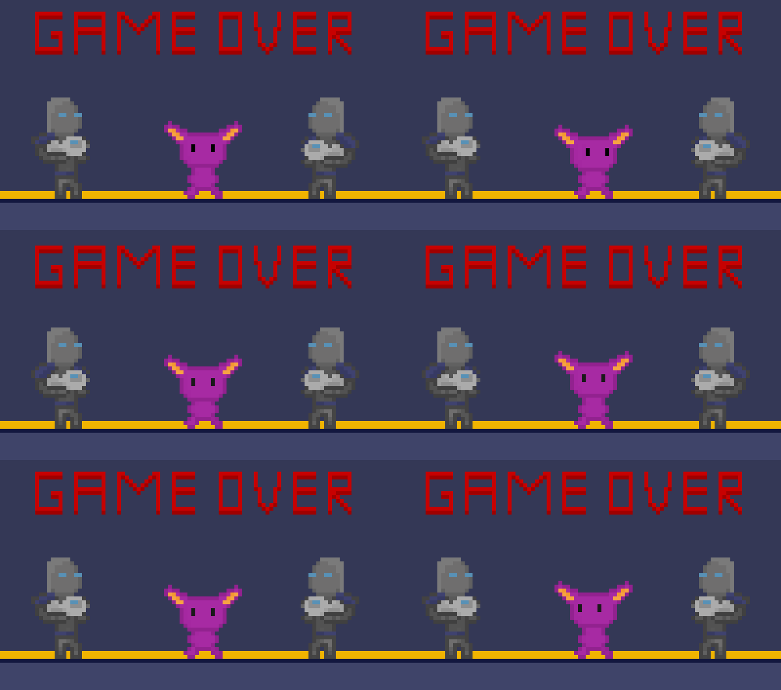
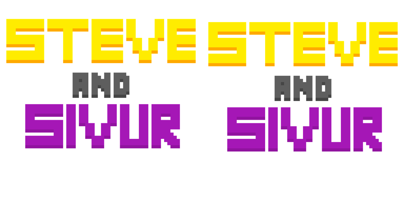
I also made some scenes for the game for when you die or finish a level:
And these are some UI elements. Menu buttons, a health bar and a medkit:


.png)
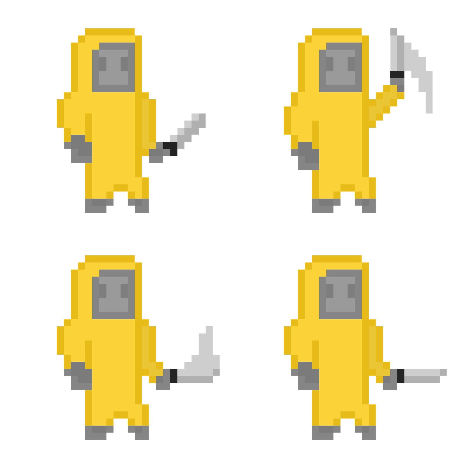
I feel these animations turned out well. They all have a cohesive style and I think that each animation effectively shows what the character is doing. Initially, I found it difficult to make the character sprites look convincing.
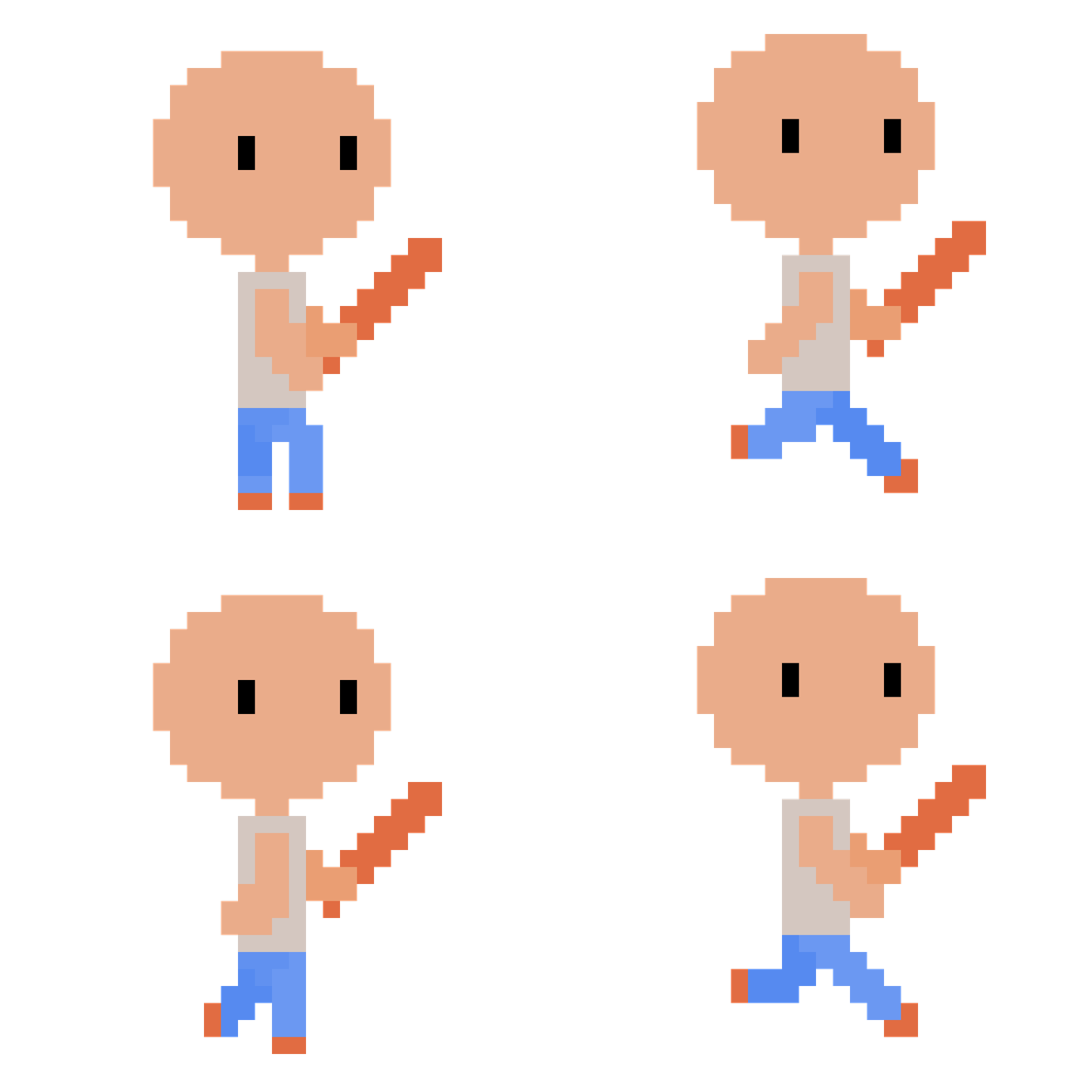
This is one of my first animations. While I am happy with it and it is clear that the character is running, it does have some flaws. For starters, the movement of the arms and legs is a bit off. The arm looks a bit floppy and the legs do not have enough positions to convincingly make it look like he is running. With this character specifically, I also had issues with the arms being the same colour as the head. I wanted him to have an attack animation, where he swings the bat from over his shoulder. However, due to this colour issue I could not do this as the arms blended into the head. I had to settle for a less effective animation without much arm movement. In my future characters I tried to keep this in mind.

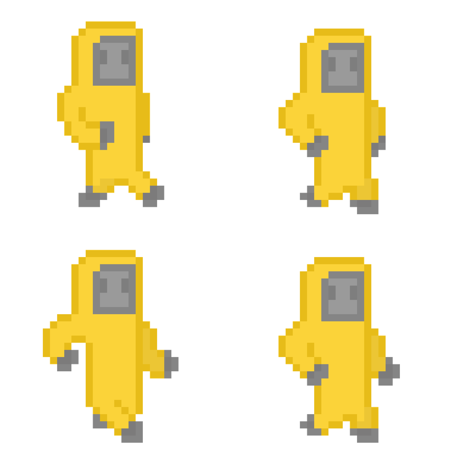
This is the protagonist character, which I made more recently and am more happy with. I made the arms thicker and shorter, which made them easier to animate and made it more unique looking compared to the basic proportions of the other character. While the legs are shorter I made more unique frames to show each leg crossing over the other. It has 4 positions rather than 2. I also made the arms more bent, getting rid of the floppy arm issue and making the movement look more convincing. To solve the issue of the different parts of the character blending together, I added a border in a darker colour, which worked great as you can now tell where the arm is as it crosses over the body. I also added gloves and boots which show where the end of the limb is.


Some of the animations ended up quite long. The army guy reload animation has 13 frames and the robot death animation has 8. I enjoyed making these animations as they were more challenging than the more simple walk. I mostly improvised these as I made them. For the robot one, I animated each part of it (like the head falling off) separately, rather than doing it frame by frame.
I also helped with some of the level design. I came up with the idea to use tilemaps to create the levels. This allows us to construct levels quickly buy painting different tiles onto the level, rather than adding many different sprites with their own collision for every platform.

.png)


.png)


Programming and putting the game together proved to be more difficult than we expected. Playground provided the basic movement and shooting but the final game was quite barebones compared to our plans. We never figured out how to switch sprites for running, jumping, death etc. This meant that many of the animations I created didn't make it into the game. We had planned to have 2 levels and 4 enemies. We ended up with 1 level and 1 enemy. The game over screen also didn't make it in.
This project taught me a lot about the importance of communication and having a clear pipeline to follow. I should have stopped making art assets and helped more with the coding.
